微信小程序
微信小程序基础
微信小程序组件
本文档使用 MrDoc 发布
-
+
首页
微信小程序组件
# 小程序组件 微信小程序组件是构成小程序的各种可复用的组件,这些组件可以帮助开发者快速实现特定功能。 1. **视图容器**:包括视图、滚动视图、轮播图等。 - `view`:普通的视图区域,类似于 HTML 中的 div 标签,是一个块级元素,常用来实现页面的布局效果。 - `scroll-view`:可滚动的视图区域,常用来实现滚动的列表效果。 - `swiper` 和 `swiper-item`:轮播图容器组件和轮播图单元组件,基本使用 swiper 组件属性。 2. **基础内容**:包括文本、富文本等。 - `text`:文本组件,类似于 HTML 中的 span 标签,是一个行内元素。小程序中只有 text 组件能够实现文本的长按选中,通过 text 组件的 selectable 属性,可以实现长按选中文本的效果。 - `rich-text`:富文本组件,支持把 HTML 字符串渲染为 WXML。 3. **表单组件**:包括按钮、输入框等。 4. **导航组件**:包括页面导航、 tabBar 等。 5. **媒体组件**:包括图片、视频等。 6. **地图组件**:用于展示地图信息。 7. **画布组件**:用于绘制图形。 8. **开放能力**:包括位置信息、设备信息、用户信息等。 9. **无障碍访问**:为视障用户提供访问小程序的能力。 ## 视图容器组件 ### view组件 普通的视图区域,类似于 HTML 中的 div 标签,是一个块级元素,常用来实现页面的布局效果。 wxml: ```html <view class="container1"> <view>A</view> <view>B</view> <view>C</view> </view> ``` wxss: ```css /* 设置每个view的行高和宽度和居中 */ .container1 view{ height: 100px; width: 100px; text-align: center; line-height: 100px; } /* 设置每个view的背景颜色 */ .container1 view:nth-child(1){ background-color: antiquewhite; } .container1 view:nth-child(2){ background-color: blue; } .container1 view:nth-child(3){ background-color: pink; } /* 设置父标签的flex与水平居中分布 */ .container1{ display: flex; justify-content: space-around; } ``` 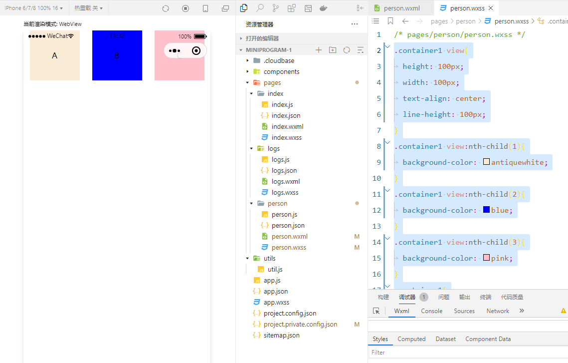 ### scroll-view 可滚动的视图区域,常用来实现滚动的列表效果。 wxml: ```html /* 标签改为scroll-view,添加属性scroll-y为纵向滚动,scroll-x为横向滚动,需要设置固定的高度或者宽度 */ <scroll-view class="container1" scroll-y="true"> <view>A</view> <view>B</view> <view>C</view> </scroll-view> ``` wxss: ```css /* 设置每个view的行高和宽度和居中 */ .container1 view{ height: 100px; width: 100px; text-align: center; line-height: 100px; } /* 设置每个view的背景颜色 */ .container1 view:nth-child(1){ background-color: antiquewhite; } .container1 view:nth-child(2){ background-color: blue; } .container1 view:nth-child(3){ background-color: pink; } /* 设置父标签的高度和宽度,添加一个边框便于区分 */ .container1{ height: 150px; width: 100px; border: 1px solid red; } ``` 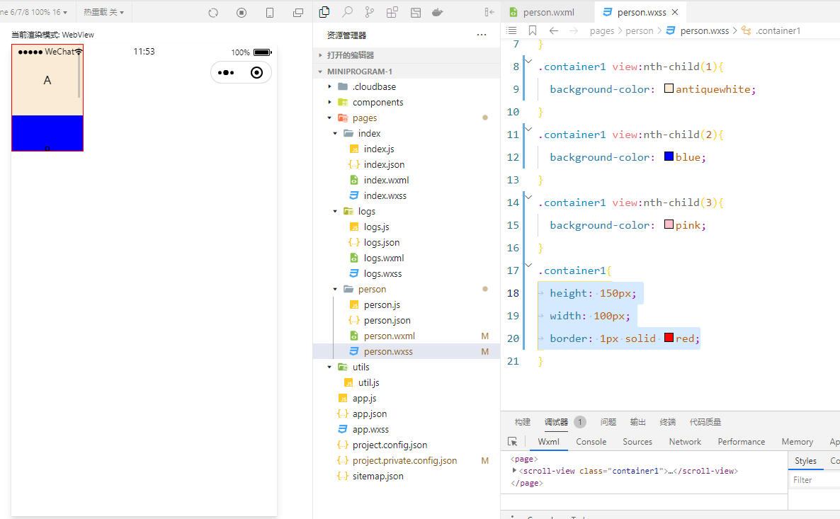 ### `swiper` 和 `swiper-item` `swiper` 和 `swiper-item`:轮播图容器组件和轮播图单元组件,基本使用 swiper 组件属性。 wxml: ```html <swiper class="swiper-container" autoplay="true" circular="true" indicator-dots="true" indicator-color="white" indicator-active-color="gray"> <!-- 第一个轮播图 --> <swiper-item> <view class="item">A</view> </swiper-item> <!-- 第二个轮播图 --> <swiper-item> <view class="item">B</view> </swiper-item> <!-- 第三个轮播图 --> <swiper-item> <view class="item">C</view> </swiper-item> </swiper> ``` wxss: ```css /* 轮播需要一个固定的高度参数 8? .swiper-container{ height: 150px; } /* 定义轮播项目的高度和居中 */ .item{ height: 100%; line-height: 150px; text-align: center; } /* 定义每个轮播的颜色,通过子代选择器 */ swiper-item:nth-child(1){ background-color: lightgreen; } swiper-item:nth-child(2){ background-color: lightskyblue; } swiper-item:nth-child(3){ background-color: lightpink; } ``` swiper可以添加的属性: autoplay="true"自动轮播 circular="true" 循环轮播,默认从头开始 indicator-dots="true" 设置显示指示标识点 indicator-color="white" 设置指示点的颜色 indicator-active-color="gray" 设置活动轮播点的颜色 ### text和rich-text text是一个普通文本组件,类似于HTML的span标签,是一个行内元素。 rich-text是一个富文本组件,支持把HTML字符串渲染为WXML结构。 text: ```html /* 文本只有写在text标签中,然后添加selectable属性才能选择 */ <view> 手机号,支持长按选择 <text selectable>14718131626</text> </view> ``` rich-text: 需要使用nodes属性,里面写html格式文本,注意引号的使用。 ```html <view> <rich-text nodes="<h1 style='color:red'>标题</h1>"/> </view> ``` 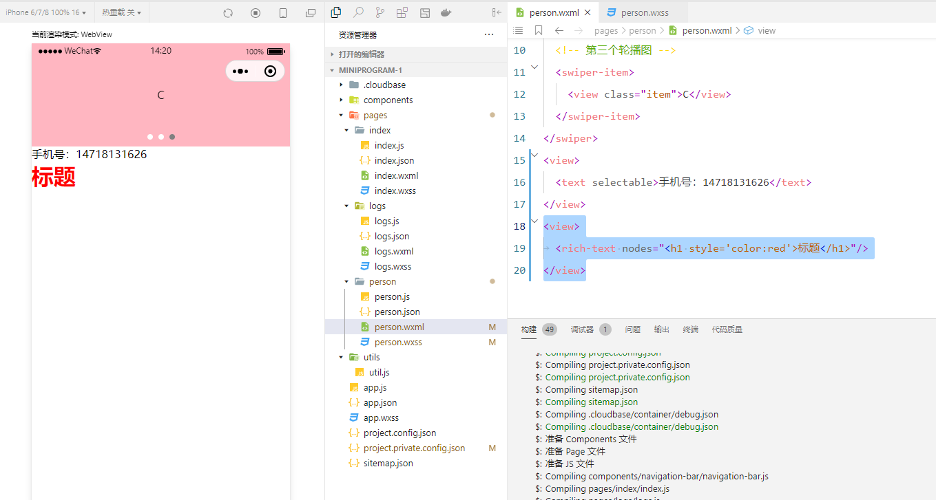
Chuck
2023年12月18日 14:39
转发文档
收藏文档
上一篇
下一篇
手机扫码
复制链接
手机扫一扫转发分享
复制链接
Markdown文件
分享
链接
类型
密码
更新密码